But for the most of us, the desire for something that simply looks good is counter-balanced by our need for something functional. While the very wealthy can buy great looking stuff that serves no purpose other than looking good, the rest of us need to strike that balance.
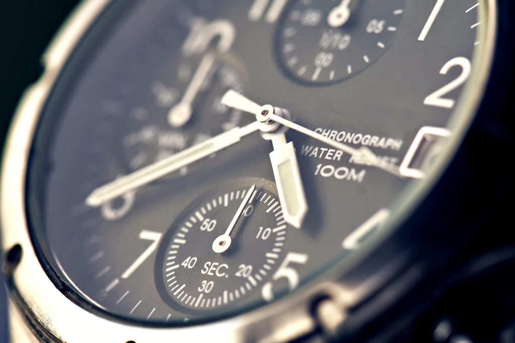
I can take an example from an area that I’m interested in – watches. The need for these items has decreased hugely over the years thanks to mobile phones, leaving them in many cases as a item with an amount of desire attached to it, but little need.
As a result, eligibility has in many instances decreased in favour of pushing the boundaries on how a watch can operate, what extra features it has (moon phase, perpetual calendar, stop-watch functions) and in many instances how you actually tell the time.
This is great for those interested in the technical prowess of a watch, but not for those who want to quickly and easily tell the time, who have grown up with certain expectations of how a watch ‘works’, and who may be relying on that watch to stay safe – a diver timing how long they’ve been underwater, for example. For those people, a tool watch with few extra features is the way to go – clear, simple, effortless.
This ‘needs and desire paradigm’ is an important one, because we can only deliver a truly exceptional and worthwhile customer experience if we deliver the correct amount of both of the above in every circumstance. That’s one of the reasons we start a web design project with wireframes, blank boxes that map out the user journey – if we can get a good handle on the customer needs and the way they will look to interact with our site, we have a solid foundation on which to build the aesthetic element.
Similarly, with print work, we start with a clear idea of what the piece is trying to achieve. That way, no matter how we choose to tackle the visual aspect, our work will be underpinned by the project’s goal.
In the next part of the series, we’ll take a closer look at how this paradigm plays a part in web design.


